Observability
Logs
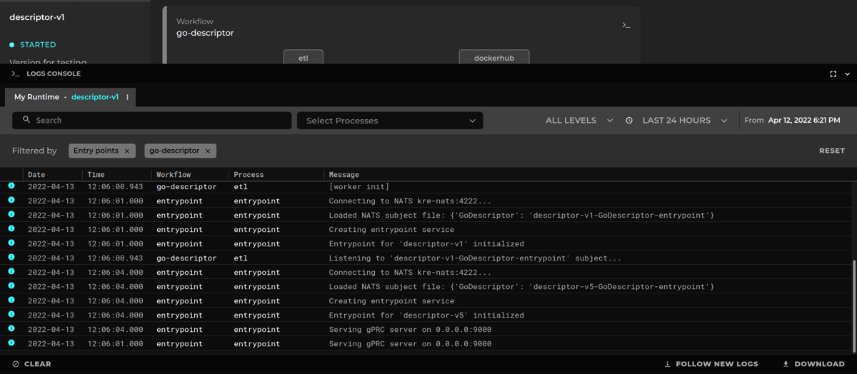
Runtimes also have a log console embedded within them, you can access the console by clicking the >_ icon in the top right corner of your desired workflow.
Runners will log some useful information as well as handling and reporting errors.
Custom logs can be added from the nodes using the logger included in the context object.
Here goes a quick example written in GoLang, this is the way we could log every time our handler is invoked.
ctx.Logger.Info("[handler invoked]")
Info given to the logger in the form of a string will later on be added some metadata, such as the workflow and node from where it comes and the time the log was created.
This is how the log console looks like:
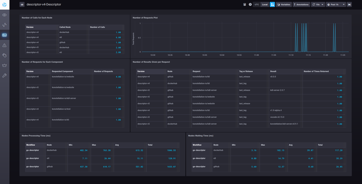
Functional Metrics
Metrics generated by nodes are saved through an InfluxDB client then displayed by a Chronograf instance.
If you are not familiar with InfluxDB and Flux queries, we recommend that you refer to our training documentation uploaded in our Google Drive regarding the usage and good practices of InfluxDB.
InfluxDB
KAI Server containerizes and deploys an InfluxDB image responsible for the handling and usage of metrics. Each runtime has its own influx bucket, to which the nodes can save metrics through the context object.
Chronograf
A Chronograf image will also be containerized and deployed by KAI Server. Chronograf will consume data from the InfluxDB through Flux queries and then display it in dashboards. To create this queries, it’s important to remember that each runtime has its own databases whose name is the runtime ID.
Several dashboards can be contained within Chronograf, one for each project for example.
Dashboards
Metrics need context and form, otherwise they would just be rows of data with no meaning. Dashboards contain several cells, each will display filtered data by a given visualization format, giving data context and form. A dashboard can contain several cells of different size, thematic and purpose.
Cells are calculated in two steps. The first one being a Flux query that retrieves, filters and processes data, then this data will be given a display format, whether it be a table, a line graph or a counter.
It is important to choose for the cell a proper and fitting visual format, so data can have a proper meaning. Data can also be grouped by tags, so several contexts can be displayed in the same cell.
Here is an example of a complete dashboard from our training repo.